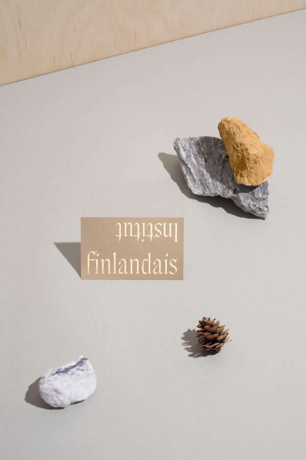
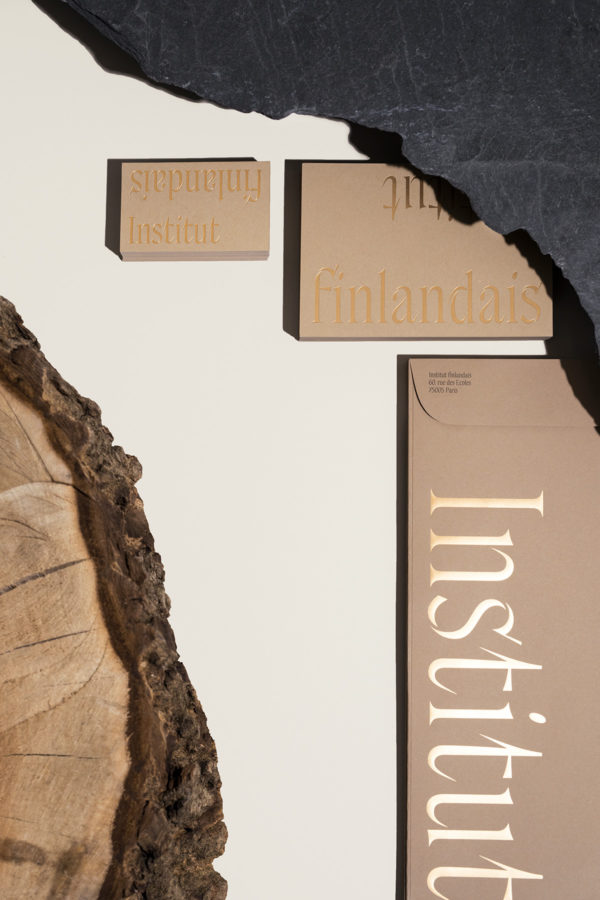
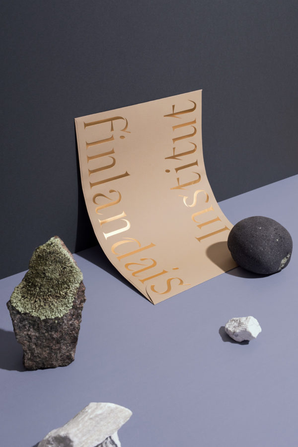
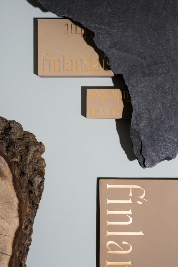
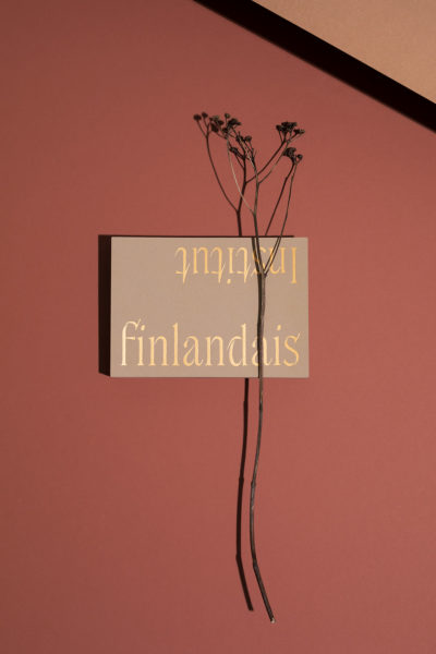
We are happy to introduce Institut finlandais’ new visual identity. When visiting our new website, you can discover a new logo, a custom typeface and a fresh colour palette. The mastermind behind the updated look and feel is Piëtke Visser, who currently works as the Creative Director in the design agency Kuudes, in Helsinki. In her work, one of the most important things is to understand people and organisations, translate their message into concepts and visual narratives. When working on the redesign of the Institut finlandais, she was inspired by the structure and colours of the architecture, of the Institute itself.
What’s your background, how did you first get into graphic design and art direction?
I am from a very small town in South Africa called Empangeni. Growing up, it was an interesting community living in a super hot subtropical climate, a mix of sugarcane factory workers, university professors, sports enthusiasts and religious fanatics. As a teenager, apart from hanging out with friends perhaps the most exciting thing for me was the after school art club. It was mysterious and surprising, and the one place where all the rules went out the door. I got hooked very quickly. At the time I couldn’t imagine anything better than to go and study fine art. I wanted to see the world, discover interesting things in faraway places, and I thought that art would get me there.
Part of the art studies at the University of Pretoria was an introduction to visual communication. The possibility to understand people and organizations and learning how to interpret or translate their goals and messages into concepts and visual narratives immediately appealed to me. And I decided to change course a little bit.
What would you describe as the most representative feature of your design?
Playfulness. I like making people smile, it is perhaps the best fix to design something that make people feel like you have really understood what they are trying to say, but didn’t have the means to visually articulate it, and now they have. It is wonderful.
I think it has been good to be an outsider, I take things at face value, separate from personal history. In fact, it is vastly different from the visual and cultural references that I know well, but discovering the world of Finnish art and design has been very rewarding.
Could you tell about the work you did for Institut finlandais? How was your approach in the beginning, and how did the process evolve?
I have been working for the Institute on and off since 2014, on various exhibition identities and communication materials. In addition, I have been working as part of the Lokal Helsinki team, curating collections for the Gallery boutique.
It has been a privileged position, being able to design materials that represent Finnish culture in some way. I think it has been good to be an outsider, I take things at face value, separate from personal history. In fact, it is vastly different from the visual and cultural references that I know well, but discovering the world of Finnish art and design has been very rewarding.
The redesign of the Institute visual identity was in part inspired by the structure and colours of the architecture, of the Institute itself. The identity aims to portray Finnishness that is at once earthy and natural yet sophisticated and timeless. Together with Juho Hiilivirta, Niklas Ekholm, from Helsinki Type Studio, we created a custom typeface conceptually rooted in cultural exchange. We took the connective role of the institute quite literally by making the letters reach out to each other like in a connected cursive script. The end result is an identity that surprises, with very tactile contrast between the choice of materials, natural recycled paper, glossy brass foil and the delicate yet confident typeface.
What brings you inspiration?
Daydreaming and talking with people who have new plans, ideas or purpose. Ideas, whether it be remarkable or silly, ultimately reflects and questions the way we do things. The best part is the ‘what if’ bit.
You have lived and worked in Helsinki for 14 years now. How would you describe the current creative trends and aesthetics that prevail in the local scene? Are there some features that distinguish it from other places?
I’ve seen the Helsinki visual design circle grow bigger in progressively more interesting over the past few years. Overall I think visual design has become more playful and approachable, slowly moving towards fulfilling its potential of enriching and supporting people’s everyday lives.
Could you mention any people or agencies who you find particularly interesting at the moment?
I can’t get enough of the @boschbot twitter feed. Every few hours it posts details from Hieronymus Bosch’s Garden of Earthly Delights, and it is just incredible. Startling and fascinating to discover how contemporary it is.
Current enthusiasm include the Experimental Jetset, Astrid Stavro, Allan Fletcher and studio Franklin Till.
Besides your freelance projects, you’re also the Creative Director at Kuudes; can you tell me what your role involves and what a typical day is like for you?
Working in a team like Kuudes has been rewarding. I work with clever and very capable people every day. I am the creative lead for the visual design team, that works with a broad range of clients, all the way from the big brand fast moving consumer goods to small boutique startups. And a lot of meaningful public sector projects in between. The most significant reason for this range is the broad and diverse talent pool at Kuudes.
A good example of one of our projects is the non-profit coding school Hive, initiated by Supercell and based on the French Ecole 42 model. Kuudes has been involved from the outset, the initial research, defining the school’s position, clarifying the student and stakeholder insights, building the brand strategy, crafting the brand identity and which is currently ongoing, the interior architecture and spatial concept of the school.
What is really typical at Kuudes, is that you will never have the same day twice.